Cher Phillips
Views on online media and journalismMis-heard Messages
We weren’t able to post the packages yet, so I don’t have a link to the video. But this is the text from our project.
African-American Churches: Mis-heard Messages
By CHER PHILLIPS and BRITTANY RAJCHEL
One of 15 traditional black churches in Gainesville, Fla., deals with stigmas of racism and misunderstanding, while their real message remains buried in daily services, Bible studies and community outreach – not in the speeches and press statements of the politically active.
Jesus People Life-Changing Church, 800 N.W. 39th Ave., has about 350 black parishioners who continue on learning about life and ignoring the very public outcry about issues that won’t ever enter the walls of their community. Why? The church is above it. In fact, it doesn’t have anything to do with it at all, says their pastor, Horace L. Mingo.
Guitar Hero just makes me mad
When I wrote the wrap-up for the first toolkit class, I thought that it would have been helpful to take the class again when newspaper had a better idea of how they wanted to cover producing the work we did with Soundslides.
I feel the same way about video. Only, I would have to add that I think perhaps this class is too far ahead of the professional learning curve.
I feel like there were many practices in this class that were not reflective of regular newsroom practice, and I am not sure how helpful they will be in producing short news videos for web packages for a newspaper. I am not sure that the emphasis on documentary film making and broadcast news styles will serve online journalists. I simply do not think the documentary film making methods is appropriate for producing news.
The methods we used in this class took so long to create so little that I simply can not see print journalists adapting these practices.
As for what I will use again, I will probably play around with shooting some video for work (current not journalism) and machinama. I will put the 5-shot method to use in this, though. I’ve also started playing with video streaming. Most of this is this for fun though. I can’t see being able to tell any future employer I am good enough at this to produce serious journalism. In many ways, this class felt like it was trying to present the print equivalent of a senior capstone course to students who hadn’t taken MMC2100.
I *still* am not comfortable with the equipment. It scares the crap out of me. And people who are afraid of their cameras (or any type of electronics) don’t take great footage. That is just it, practice with something like this goes far. We needed more of that.
I like that my college wants to be on the cutting edge, or some people working their want to be on the cutting edge of what the profession is doing, but it’s frustrating to be a student in that space.
This will not make me very popular. But then I never really cared about that. Why start now?
I was incredibly disappointed in the my journalism school’s computer equipment and the limited access to the Interactive Media Lab. The master’s students studying online media (enrolled in a practical class that term or not) should have full access AT ALL TIMES to the equipment provided here. We should have had it back in September. I know that I could have used this lab instead of spending my own money on things for my McIntosh blog when I was keeping it up.
Instead, this seems to be being used exclusively to what end … I can’t really tell. My god, during one of the few days our class met in there, the folks (not our class) were playing Guitar Hero while we worked.
I know Mindy tried hard to provide us with what we needed, and it was very frustrating to not have things work properly because of aged and outdated computer labs. In context, this is even more frustrating having the knowledge that just across the building Guitar Hero is taking priority over the content of the courses in my master’s program. And I like computer games. But come on. Get serious here.
Let me be clear: this last point is no reflection on Mindy. This is a reflection on the School of Journalism and Mass Communications at the University of Florida.
Lebrew Jones – great package, yet reaching
About halfway through the online package on Lebrew Jones and the Death of Micki Hall when it became clear why the reporter was questioning Lebrew Jones innocence, I said “Oh my God” loud enough that someone in the next room wanted to know what was wrong. 
I found this story riveting. It was easy to read and the online design did a wonderful job of pulling me through it. The writing was very strong while being concise.
There were some things that I thought would have improved my experience.
The first video told the same story written in the first two pages of the written story. This was a temptation not to want to open any more videos, or read further into the story. I could easily have made a choice at this point and simply done one or the other. Maybe that’s good, maybe it isn’t.
The videos also do not have a start and stop feature. People kept coming in and talking to me, and I had to start video segments over, instead of pausing. 
I thought the handling of graphic material was tasteful.
The story was told in an in-depth fashion. I didn’t feel robbed of a good read. When I see succinct online writing, that’s generally what I think will happen. However, I did want a little more, but that’s me.
I wondered about the Christine Young’s role in the story. She is a part of it. There was a point when she was interviewing the sister, when her question interjected showed her desire to prove someone other than Jones was guilty of murder of the young woman. I wondered about the ethics of the story and found that Al Tompkin’s rave review of the work on Poynter’s site. However, I liked very much the credit page.
I also had some nagging questions about a point revealed in the telling of the story. This man had a 66 IQ – isn’t he mentally disabled or very close to it? Why wasn’t that point given more strength in the story? I also came away from this work with the strange feeling that maybe the author was suggesting that the van driver killed Micki Hall. In the opening, she pointed out that the driver didn’t like Hall. The forensic sources felt like they were pointing in that direction, with the character breakdown of how the killer might feel from the staging of the photos and the several times Young brings up how he left. Maybe it’s the narrative that begs a protagonist. But I found this kind of reaching too much.
Blogging 1 – Video comparison
I compared two Washington Post videos that looked at voters and the candidates running on both sides of the party fence.
A View From the Pulpit edited by Ben de la Cruz.
I liked that this video focused on the people and not the candidates. At one point, a group of women were talking about how Hillary Clinton would be saying a few words. But this address wasn’t shown emphasizing that the people and their impressions of these candidates. In fact, neither candidate was in the piece directly at all. The story wasn’t a narrative one, per se, but I do think it was a story. And I like that. I liked that this seemed very balanced to me. The video addressed the historical aspect of the candidates gender and race.
I felt it was a news story about how an influential group of black Americans in the nation’s capitol perceive. The video opened with a response to Bill Clinton’s comments that seemed to attack Barack Obama, and it lead out from there on whether black spiritual leaders supported one candidate or the other. I felt it had a strong news peg and then branched out from that point. The story involved what the WHOLE black community might think, while the next video I watched seemed more focused on individual sound bites.
A Day at the Beach With GOP Voters
I chose a video that would be in the same news group also by Ben de la Cruz and found it to be completely on the other end of the spectrum, even though it was basically the same idea as the first video. What do constituent groups think of the candidates?
It opens clips of voters’ responses and then relies on text to set up the video. I’d be harder pressed to call this a story than the other one. There’s nothing cohesive in there to give the material some kind of arc.
There were several really weird shots included. While some imagery that in places is beautiful, some clips gave me the impressions that the film maker doesn’t take Republicans as seriously as he takes the black voters. The beach shots at the beginning are lovely. Yet, the fun house clips throughout serve to distract. I am sure they’re meant to give the context of setting to the video up to the sunset at the end. Two shots really hit me as plain odd: a man randomly running and screaming and a shot of a pirate ship while one Republican was talking about Hillary. I still don’t think this is a story because it seems to miss reaching the greater context that the other video attained. I do think this is captures the viewpoints of a group of people and has strong news value for that reason.
Missing Link
Yes, yes. Class is over. This doesn’t count. But I needed to add it because this was the missing link in what I think I was trying to say when wrapping up the class.
So, I have time to read things that I want to read. Cull down e-mail. Get ready for some fabulous time off.
I found this little gem in my in-box of mail pushed aside until I had time to deal with it. I pulled it up, and this package by Tom French on Tampabay.com is what I’ve been thinking about, dreaming about, hoping for as I took this class. It’s in-depth writing — the kind of newspaper writing that you save to read with a good cup of coffee — coupled with Soundslides and the best of toolkit tools.
I’ve not read and watched it yet. Like I said, I’ve been hording it for later when I can savor it. But I’ve enjoyed most eveything else French has done.
Merry Christmas and Happy Holidays all. See y’all next year.
Jello-Kit 1
One feeling I’ve never been able to shake in this class is that we’re in uncharted territory. The area of journalism covered by Toolkit is like Jello that hasn’t set yet. Everything about it still way too fluid from the technology to the practice.
My other classes at UF in the practical matters of journalism have been based in what actually happens in the field. However, with Toolkit, I know that the newsrooms are figuring out what to do with new media at the same time we are trying to prepare ourselves for careers. To be honest, it’s a little disconcerting, and it makes me want to have the option of taking this class again in two years and again two years after that and so on and so on. But then again, that’s probably why I’m drawn to it. To appreciate new media, you have to be willing to accept that there’s always something newer coming down the pike.
That being said, I think as this class earns its legs, there’s a real need to have some of the material from it bleed into the other classes in journalism schools.
Over the semester, I’ve thought about some of my undergrad classes and how they would have better prepared me for the journalism world if they’d introduced some of the collection methods we’ve talked about this semester.
For instance, I don’t think I would appreciate Soundslides as I do had I not taken literary journalism. Understanding how the elements of a style can be used to breathe life into a true story is vital to seeing why some of the Soundslides Mindy has shown us this semester resonate with us.
Other classes I’ve thought about are reporting and editing. Everything we learned in reporting class about collecting good information, and editing class about how to pick the information that pops, seemed SO much more vital when making a Soundslide. Maybe this is because of the limited about of time in a Soundslide.
I’ve also found myself envious of classes that will come after us. Although, I wouldn’t have wanted not to be taking this class at this time. I know it’s the kind of class that will get better as technology advances and as the professionals feel out what they want from graduates. I kind of like having a seat in the middle of all of it to see what’s to come. I wouldn’t have wanted to miss it.
More than all of the academic studies that go with other grad classes, this class has succeeded in making me think about what kind of journalism I’d like to see practiced in the future. As groovy as I think Soundslides are, I also think there’s a case to be made out there for the written story. As we culled out content to fit into Soundslides, I really, really missed how using words and the space that goes along with a written story to go more in-depth. It worries me a little bit. This is going to seem like a snooty print-major comment. But as print journalists take up learning some of the ways of broadcast journalists and we teach audiences to expect this form of journalism from us, I fear the loss of the depth and details that come with a written story.
For me, I think that’s what I’d like best to see resolved as we continue to sort out what goes into a journalist’s toolkit. Well, that and how to carry all cameras, recorders, mics and mic stands around with us. It sure was a lot easier to tuck my pen behind my ear and shove a reporter’s notebook in the back pocket of my jeans.
A little devil’s advocacy about repurposing
After the graphic class, my eyes were glazed over with the Adrian Holovalty message we discussed in class about repurposing data. His crime map was seriously cool, and my thoughts turned to the kind of public records that could be mined and what we could learn from them morphed around and examined from different perspectives. Just think of all things that officials would like us to continue to miss. Oh, if we could only computerize I.F. Stone… tearing those newspaper pages down the center so he could manage the broadsheets more easily sift through the nuggets in all the stories looking for something someone else overlooked.
Looking back though, I’ve got to add that I do have a misgiving about the entry in question about how newspapers need to change. I’ve got to play the devil’s advocate here when it comes to Holovatly’s critique that about news being too story centric.
“One of those important shifts is: Newspapers need to stop the story-centric worldview.” – Adrian Holovolty
See, I don’t think there’s anything wrong with information being story centric. In fact, I think it’s a very good thing. I do see Holovalty’s larger point that if all the info we are mining gets tossed out there in unsearchable data blobs, we are losing the ability to have our fancy computer gadgets sift through it. Kinda like the difference between working with a PDF jpeg and a PDF text file. He makes a good point, a good, STRONG point.
But I have to worry about turning over the keys to the techies.
We’ve talked a lot about the role story plays in any kind of journalism product. I love to post pure information on my blog, including audio files. Truth be told, people would rather I write them a story. (Oh, they like to complain about what I write when I do but that’s another story. See, story.) People would rather I package up what happened in the meetings into a story rather than give them useful information blobs.
Holovalty also wrote, “The problem here is that, for many types of news and information, newspaper stories don’t cut it anymore.”
I disagree. I think there’s got to be a happy medium here between data and story telling.
Repurpose the information in those stories ’til your heart’s content, but let’s just give it all up and be cliche and try not to throw the baby out with the bathwater.
Graphic experience
I enjoyed the second part of this story a great deal more than the first, with a couple exceptions.
Reporting
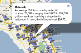
I chose to create a map and look at what the water rates are across the state. I’ve said for a long time that I think McIntosh has the cheapest rates in the state — as far as I can tell. I think this remains true. I called or searched out at least one county offices, city and town halls and utilities from every county in Florida. I thought for sure some of the smaller towns in the panhandle would be lower, but I still have not found cheaper water rates elsewhere.
I also found it was fun to talk to other town clerks about their water. It stopped being fun in McIntosh a long time ago. It reminded me of how reporting on McIntosh USED to be when I first started doing it. I targeted small towns and cities and utilities for the rate comparison. I was surprised that some small towns have gone as far as requesting the water management districts do a study on how much they should raise their rates to accommodate future demand and shortages. In McIntosh, the council just raised the rates in October for the first time since 1991, and they went for the most they thought they could get away with. Nothing scientific in that decision.
On the other hand, I actually talked to staff at one town office who thought their rates were 2 cents per gallon. I had to call them back when I figured the rates. A bill for 23,000 gallons of water would have come to $420. The first woman I talked to was really angry when I questioned her about it. She transfered me to the second who confirmed that the rates were 2 cents a gallon. So, I chatted her up in another direction. It turns out they don’t really KNOW their water rates. Jimmy — the man who set up the formula in her computer — knows it. It’s .002 per gallon, by the way. And even they are higher than McIntosh.
As for the rates, I think where McIntosh loses money compared to other water providers is in their tiers and the amount included in the base rate. For instance, for $9 you can get 5,000 gallons of water in McIntosh. Other places include anywhere from zero to 3,000. The other trend that they town is behind on is charging high volume users more. Across the state, you can see in the rates that anything above 20,000 gallons a month is excessive.
McIntosh has some serious volume users. I chose May for a month to pull an average from for this graphic. It gave me a month where the residential average hit the low 20’s. It wasn’t unfair — choosing a summer month when people water a lot. I also realized why December is such a low water use month two weekends ago when the residents started dragging out their Christmas lights. No one wants to get electrocuted, so they stop watering. McIntosh’s highest residential water customer went from 151,000 gallons down to 14,000 in December. It should be noted that she and her husband won their division for the Christmas decoration contest. (It’d be totally OK to think Griswald’s, here.)
Resources
Ironically, a number of McIntosh’s high volume customers are current and former town officials. I posted a yearly usage report online without names on it and referenced it in my resources for the map. I have another one with names that I’ve used to separate the residential users from commercial users — but I can’t post it without angering the masses. Officials were unhappy that I have a copy of the report altogether. Imagine that.
The other problem I ran into with resources was how to cite the number of sources I referenced to get the water rates I used. I called the offices I couldn’t find online. But still there were 69 different water providers included in my graphic. There was no way that info would fit into the space underneath the map for me to link their websites to…
So, I thought I should put them in the graphic. Talk about easier said than done. You have to be a genius to get links to show up in a Google map graphic sourced from a Google spreadsheet sourced from an Excel spreadsheet. And I am so not a genius.
I had to use code like this in the Excel file: =CONCATENATE(“<a href=”, “http://www.clayutility.org/myhome/current_rates.aspx”, ” target=”,”_blank”, “> See rates.<a/>”)
And then loop it through the directions cell like this: =CONCATENATE(“In “, C13, “, 23,000 gallons of water would cost <br/> a single-family residence $”, “<b>”, F13, “<b/>”, “.”, B13)
Then – transfer all that up to Google docs, then into Google Maps.
Some of the trickier problems was how to handle quotation marks within HTML code in a href tags (to make links) and target_blank tags (to open the links in a new window.) I made a discovery that anything I linked opened the water sites within the window of my project rather than a new window. Anyway. The above works. But it took some playing around.
API
So all was well until I tried to load this thing live. I’d had happy times with my push pins using local drives. But when I loaded the beast live today, the Google map crashed — because live it needed an API key. (Something I had to sign up for through Google, eventually, using my Google account and giving them the addy I am running the map from.)
Then, Google crashed this afternoon. No fooling. I kinda freaked at the prospect of doing this whole thing over in another kind of map. But then the whole of Google crashed. Good times. No support. N0 blogs. No nuthin’. We’re in trouble folks, if we’re this dependent on a search engine. Well, I am, anyway.
I found some documentation that said I didn’t need an API key to use a Google map, however this wasn’t true when it came to loading a Google spreadsheet into a map. How did I get it to work?
Truth be told, I’m not sure because I was trying alot of things. I went here first to set up an API.
What I can’t tell you is whether or not I used the API key or the URL I registered in the map generator. I tried both more than several times before it shook loose and worked for me. The Google crash probably didn’t help matters.
Final story package
I posted my final story package.
When putting the package together, I concentrated in putting the water rates in McIntosh in perspective in comparison to the rest of the rates statewide.
HTML/CSS Class Notes
I took some pretty serious notes during the 11/8 class for one of our classmates who was out that day. Messing around with Google Docs finally gave me an idea on how to link them here.
Funny. Looking back at them now, they probably don’t make sense to anyone but me. Further, I don’t know how anyone can learn HTML or CSS without trial and error. I just had to break and fix pages when I was learning it before I finally understood how it worked.
Since so much of what I learned in the beginning MMC class several years ago was stuff I sorted out online, I liked hearing Mindy’s take on the roles of CSS and HTML and the greater purposes they serve within a web site. I admit, I’ve misused style with the HTML in my time, rather than relying as I should have on the style sheets. But I’m getting better.
Most of the chotsky stuff we added to our blogs I already knew about. Those that I didn’t, I didn’t find necessary in my life. I’ve been thinking about how these tools are very much about personal preference. Therefore, as far as I’m concerned, I only want to put what I use to collect feeds and what-not on my site. It seems like a pain in the butt to have to put ALL of them on your blog. But when you think about hosting a blog that appeals to a lot of people, there’s the reason to pop all those services out there on your blog in terms of greater blog exposure and in terms of having buttons that mesh with the services potential readers use. I’m still not a fan. But I see their value.


You must be logged in to post a comment.